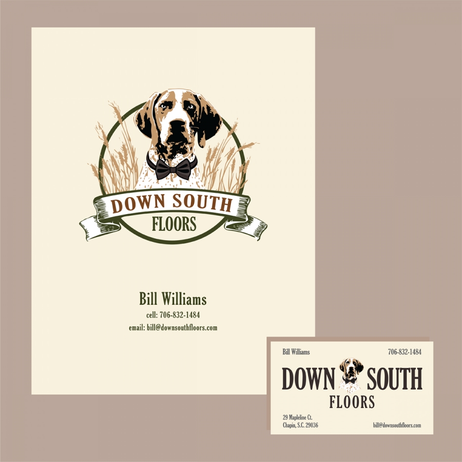
Down South Floors
gets a refresh!
How long have you been using your current logo? Is it not quite what you wish it was? Maybe it’s some clipart put together when you first opened your business? Ready for a little refresh? Looking for something new and current? Let me help!
Don’t be afraid to change things up a bit! Logos get updated often by companies, both large and small. Take a look at these logo updates from 2021 on designbro.com :
Sometimes, even small changes can give a logo a more up-to-date feel. Simple changes, like a new palate of colors or a font style change that will keep your logo identifiable and still present a revamped look can make a difference.
Back in the Fall, I acquired a new local client, Bill Williams, of Down South Floors. I love working with locals and getting to know more about their small businesses and the owners in my area. Although I still haven’t met Bill in person, talking to him by phone and email has been a delight. Warm, easy, appreciative and friendly, I can see why he has had a successful run with his company and continues to thrive.
Williams emailed me about doing some display headers, featuring his logo – with a revamp. He included a lot of detail about his current logo and his clientele. He explained what he likes and what he doesn’t like about his logo. The information he gave me was helpful in understanding that he didn’t want a rebrand, but only some changes to refresh the logo. Centered by an adorable hound dog, Bill’s idea was to make the dog look a bit more friendly and more appealing to women, who he explained, are his primary clients. His email included these logo bullet points:
- Personality: Warm and sincere
- Voice: Soft
- Tone: Soothing
- Style: Casual
- Look: Southern
- Colors I like: Shades of amber / brown (light to dark), Smokey Greys, natural wood colors (red oak, white oak, hickory)”
I liked this list. It gave me a feel as to what he wants to project with his company, as well as his taste in graphics! We removed the dog’s collar and added a bowtie and changed all the logo colors, which included lightening the dog and adding a bit softer touch to him. After completing his new logo and the display headers, Bill asked me to work on some notebook covers, notebook binders and business cards We continue to work together and I recently worked on some price cards for his individual floor samples. You can’t find Bill online, but you can take a look at his new and refreshed logo!


